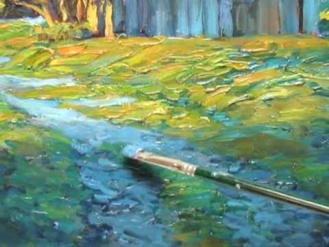
                                              THE COLOR OF SHADOW
                          The color of light and the color of shadow relate to each other. If the relationship between light and shadow is inappropriate the reality of the scene is marred. Getting shadow color right is often hampered by not understanding the complex light effects that modulate its color.


                          The academics solved the problem of shadow color in their own way by keeping all shadows uniformly warm. They often painted a very warm underpainting that was preserved in the final painting by semi translucent layers of color over the underpainting. This underpainting was often burnt sienna or a similarly warm, yet neutral hue. If there was any modulation of the shadow color it was by very subtle glazing. This gave a similitude of reality by ensuring that the values were extremely accurate. However, color vibrancy was lost following this formula and often a uniformity of temperature suffused the shadows with chromatic falseness.


                          The revolutionary idea of the impressionists was that reality was much more complicated and could not be described using the brown paint of the academics. Many painters began to paint in the field using direct observation to guide their color choices. Impressionist paintings immediately began to reflect a more vibrant and colorful reality. These newly discovered methods also allowed the impressionists to pack more observation into their paintings. Instead of brown shadows we began to see purples and blues. But there were even more subtleties to be discovered.


                          One afternoon I was looking out from a twenty-four story building onto a building below. There had been a recent snow and one of the air-conditioning units on the roof was casting a long shadow. I could clearly see how the shadow was warmer closer to the air-conditioning unit and gradually cooled as the shadow lengthened. For me it adequately explained and demonstrated what impressionists referred to as Monet's envelope. This principle says that objects or spaces that protrude into the blue amorphous envelope of the sky become cooler in color. Objects or spaces that retreat from this envelope become warmer. For example, spaces and deep recesses within trees and rocks will often appear warmer than the less recessed spaces right next to them.


                          It's not an easy principle to grasp. Think of it as the sky being a kind of bluish gas that wraps itself gently around every object. There are problems with this model from a strictly scientific perspective but it makes a useful metaphor. As we understand with greater clarity the natural phenomenon of light and shadow we will paint paintings with even greater vibrancy and vision.


                          THE COLOR IT IS
                          One reason that color recipes for various objects or phenomenon, such as trees and shadows, so often fail is that the color of all objects changes depending on light conditions. Sometimes the color change is quite dramatic. For example, during the late moments of a sunset objects tend to appear as variations of orange in the light and variations of purple in the shadows. The local color, or the object color without any atmospheric perspective, will be nearly obliterated.


                          The best rule is that the color an object looks like is the color it is. That may seem obvious but I find I'm constantly attempting to paint local color, the color I remember an object to be, rather than the true color that is before my eyes. I have to subdue the impulse to paint my preconceptions and make myself aware of the true color by making myself conscious of other color possibilities. Knowing some color theory can be helpful to jar you into seeing reality as it really is.


                          The color of light at noon on a clear day is the whitest the light will ever be. The light can actually look cool and the shadows warm although I suspect this temperature inversion might be a field effect (but remember; the color it looks like is the color it is). Shadows at noon are the most neutral they will ever be. Morning light tends to be a cool pinkish color that changes to a cool yellow approaching noon. After noon the light begins to turn a warm yellow which gradually fades to orange then a warm red and finally to purple. Some see this as a type of iridescence or prismatic color shift. Of course, in a rainbow we do not see colors shifting toward white in the middle of the spectrum (although in the Kelvin Temperature spectrum we do observe this phenomenon). But a chromatic shift is an interesting metaphor and serves as an appropriate reminder of the shifting color of light.

YOU ARE READING
The ART of THICK PAINT
Non-FictionSpeed your painting journey by knowing the best techniques. Brad Teare expands and adds to the best of his Thick Paint Blog-a site dedicated to painting with thick texture.

